🏦 This is the most important piece for bond markets right now
February 5, 2026 >> The implications for bonds and currencies would be huge
📢 2 High-Conviction Opportunities Today
✅ 1 → FREE 1:1 Advisory Call (PRO Priority)
🎁 Strategic, private, action-focused, Turn macro noise into a decision framework tailored to your goals.
👉 Reserve your spot: [Book My Free Call]
✅ 2 → LIVE Global Macro Strategy Summit (Dec 12-13, 2026)
🎥 Early Bird is LIVE, Stop reacting to headlines. Start positioning with a repeatable cross-asset map for 2027.
👉 Get Early Bird Access: [Choose My Pass]
Dear Investor,
The more I sit with the charts today on my screen, the more one sentence refuses to leave me alone: most investors still don’t own enough hard assets - not for the world we are slowly, quietly building.
Year in, year out,
New faces in, old faces out,
Debt keeps rising, same old route.
I want to tell you a story today. Not a dramatic story, not a headline story - one of those stories that markets whisper for months before they finally speak out loud.
I’ll walk you through it in the exact order of the charts I’ve attached, because the power is not in any single image. It’s in the sequence.
If you stay with me until the end - especially the PRO layers - you’ll see the regime shift forming before it becomes consensus. This is the kind of piece that helps you understand what others miss: not the noise, but the mechanism.
🧱 The rhythm of debt and the gravity it creates
The first chart is almost too clean.
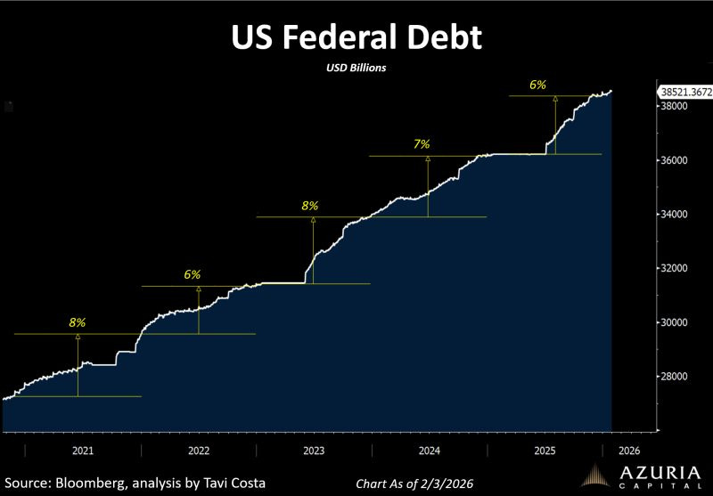
US Federal Debt is now around $38.5 trillion - about 38,521 in USD billions - and what catches my attention isn’t the level alone, but the rhythm.
The line doesn’t just rise; it climbs in familiar steps, again and again, in legs of roughly +6% to +8%.
I’ve learned to respect that kind of persistence.
A system that compounds sovereign liabilities at 6 - 8% year after year is not simply “running deficits.” It is asking the bond market a repeating question: who absorbs the supply, and at what price?
And that question doesn’t disappear when the narrative changes. Soft landing, hard landing, no landing - debt keeps following its route.
When I search history for a lesson - not a copy-paste, but a lesson - I keep returning to the moments when the market solved a structural imbalance not with one clean policy decision, but with a messy mix of yields, currency, and purchasing power.
That’s why the 1970s continue to matter as a regime reference point.
From 1971 to 1980, gold rose about +1,767%, while the S&P 500 gained only about +25%.
Different era, different triggers, but the same underlying truth: when the system becomes debt-heavy, investors start paying for what feels scarce and real.
This is why that opening line - “none of us own enough hard assets” - isn’t poetry to me.
It’s a portfolio question.
In a world where the debt line climbs in +6% to +8% steps, I don’t expect the adjustment to arrive as a single thunderclap.
I expect it to arrive as gravity: slowly at first, then suddenly obvious, expressed through higher term premium, periodic funding stress, and - very often - some form of currency adjustment over time.
🟡 The map of devaluation and the quiet message of Gold/S&P
That’s when the second chart stops being “interesting” and becomes deeply relevant.
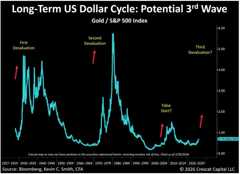
It compresses decades into a single ratio: Gold / S&P 500, sitting around 0.70 today, with past “devaluation” waves highlighted like landmarks in an old atlas.
I use the word “devaluation” carefully.
Not as a slogan, but as a mechanism. It’s what happens when a system, faced with structural pressures, finds it easier to adjust the purchasing power of money than to accept the full pain elsewhere.
Sometimes it’s explicit. More often it’s implicit, showing up as a long grind rather than a loud announcement.
History gives me two moments I never forget when I look at this ratio.
In the 2000 - 2002 unwind, the S&P 500 fell ~-49.1%, while gold rose ~+12.1%. In the 2007 - 2009 crisis, the S&P 500 fell ~-56.8%, while gold gained ~+24.4%.
I’m not citing these because I want to scare anyone. I cite them because they reveal a pattern: in certain regimes, the hedge you thought you didn’t need becomes the asset that keeps you calm enough to make rational decisions.
There’s also a statistical anchor that makes this more than intuition.
Gold’s relationship to real yields is one of the most persistent in macro: it is often estimated around -0.82, meaning it tends to move strongly against real rates.
When real yields become harder to sustain - financially, politically, or economically - gold often starts breathing again.
That’s why I didn’t dismiss Crescat’s comment about the recent pullback as “noise.”
The market reaction tied to a potential Kevin Warsh-era Fed narrative can feel dramatic in the moment, especially when it hits a crowded positioning pocket.
But the bigger picture rarely changes because of one Friday move.
The bigger picture changes because debt trends don’t stop, because real yields can’t float freely forever in a system that depends on stability, and because liquidity and confidence are more fragile than they look when everything is going up.
So when I hear “Warsh might be less dovish,” and then in the next breath I hear the expectation that he may still favor lower rates in 2026 - and the President openly wants lower rates too - I don’t reduce it to a personality story.
I translate it into a regime question: if the market begins to price cuts while the debt machine keeps stepping higher, then gold corrections can behave less like endings and more like resets.
A chance to step back, breathe, and look at the big picture without panicking - exactly as Crescat suggests.
🏦 When growth looks strong but the plumbing starts to speak
The third chart adds a strange twist to the plot.
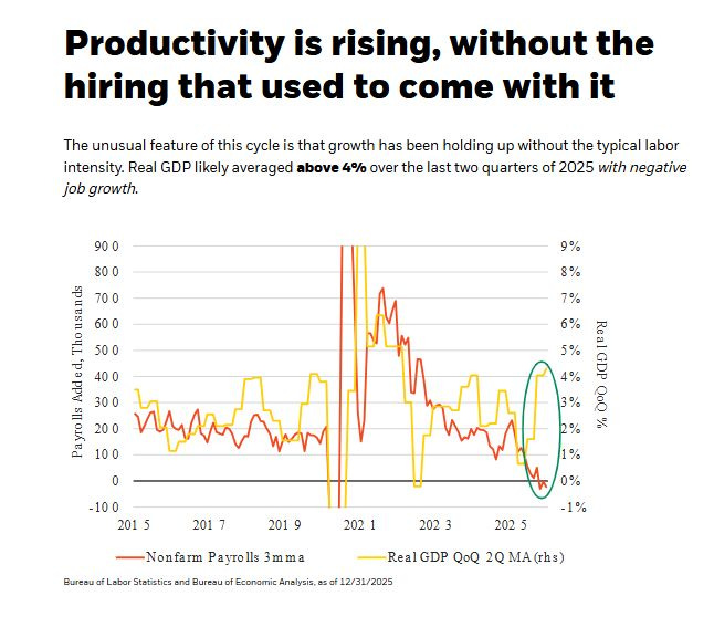
Productivity is rising, yet hiring isn’t doing what hiring usually does in expansions.
Real GDP likely averaged above 4% over the last two quarters of 2025, while job growth turned negative.
I read that as growth wearing a mask.
The numbers say “strong.” The labor engine says “not so fast.”
And that mismatch matters because markets don’t live on GDP alone - they live on expectations, on sentiment, and on how financial conditions shape future earnings.
In the short term, productivity-driven growth can keep the cycle alive longer than people expect.
It can preserve margins, protect narratives, and keep risk appetite warm. But in the medium term, it can also make the system politically and financially sensitive: because society doesn’t feel GDP prints the way it feels job security, and because a market held up by story becomes more vulnerable when discount rates rise.
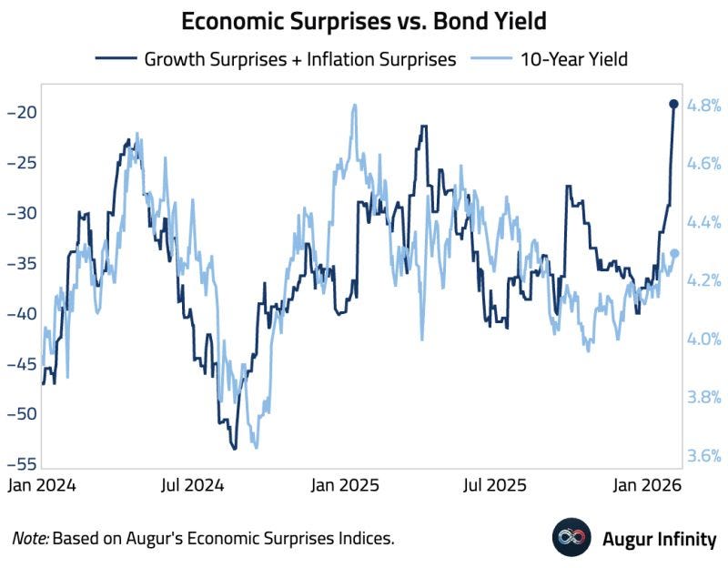
And that brings me to the fourth chart - the one that, to me, feels like the hinge between “macro story” and “market reality.”
We’re seeing the 10-year Treasury yield push toward roughly ~4.8% while economic surprises don’t cleanly justify a “growth breakout.”
That is decoupling. That is structure taking the wheel.
I like to anchor regimes with real episodes, so I keep returning to 2023’s clean example of a rate shock.
From July 31 (3.97%) to October 19 (4.99%), the 10-year yield rose about +102.5 bps, while the S&P 500 fell ~-6.78%.
The numbers are simple, and the implication is uncomfortable: equities can fall not because growth collapses, but because the discount rate rises for reasons that have little to do with “good news.”
Even more telling than the drawdown is the linkage beneath it.
In that episode, the relationship between short-horizon equity returns and changes in the 10-year ran meaningfully negative - around -0.61 on a 5-day basis.
That’s not a slogan. That’s a measurable regime: when yields rise due to term premium, supply pressure, and liquidity dynamics, equities behave as though the floor under valuation is being lifted.
At this point in the story, it becomes impossible for me to ignore the plumbing.
Because when the bond market starts moving on structure, I immediately ask: what happens if policymakers try to tighten liquidity on purpose?
⭐️ This is a paid content, so scroll to read it…[🎁 #7 BONUS if you become a PRO today]
If you’re a PRO subscriber, make sure you’re logged in to access the full piece.
If you’re still a FREE reader, you have exclusive options to unlock this special edition and all past PRO content.
🎁 Special Today - 7 bonuses if you become a PRO (FREE)👇
(These bonuses alone are worth more than the subscription.)
🎁 BONUS #1 - Price Locked Forever (you’ll never pay more)
🎁 BONUS #2 - Monthly Live Mastermind (value: $1,197/year)
🎁 BONUS #3 - Full App Access: all exclusive content, anytime, anywhere
🎁 BONUS #4 - Private Community Access: the Macro Mornings Family
🎁 BONUS #5 - Premium charts + Macro Asset Dashboard (FREE version)
🎁 BONUS #6 - Full access to 650+ advanced research analysis
🎁 BONUS #7 - Free copy of my book “51 macro strategies”
🚨 February 2026 Flash Sale
✅Macro Mornings PRO (Save 40% forever)
Only 9 spots left → FROM $570/year TO $342/yr (or $29/month)
✅👑 Lifetime (Best value)
Only 6 spots left → FROM $1,140 TO $798 one-time (or $13/month)
🗣️ TrustPilot - Don’t take my word for it - read what others say about us.
👉 After payment, you’ll receive a Welcome Kit by email with all the material and instructions to join.
2. 👉 Or start your 7-day FREE Trial - exploring only the PRO analyses without any risk.
If you’re serious about understanding what comes next - and acting before the crowd - this email is your edge.
Keep reading with a 7-day free trial
Subscribe to Macro Mornings 💡 to keep reading this post and get 7 days of free access to the full post archives.


