🚨[MACRO OFFICIAL STATEMENT] Nobody is talking about it
February 8, 2026 >> This is the biggest move from the Trump administation
🎥 → LIVE Global Macro Strategy Summit (Dec 12-13, 2026)
EARLY-BIRD is LIVE for a limited time
🔐 Bonus: your ticket price is credited toward Macro Mornings PRO
📆 Full Agenda & Speakers → here
👉 Build your 2027 cross-asset playbook with Featured Guest Speakers.
🎟️ PRO PASS (Most Popular) → $49 (then $79)
🎫 VIP PASS (For serious builders) → $149 (then $249)
🆓 FREE PASS (limited access) here
Dear Investor,
I rarely open a PRO note like this - but today I have to, because what you’re about to see is not a collection of charts. It’s a sequence. And sequences are where regimes change.
If you scroll too fast, you’ll miss it. If you read it in order - the message becomes almost uncomfortable in its clarity: something big is shifting beneath the surface, and the headlines are completely focused on the wrong thing.
→ It begins with a quiet warning most investors ignore: relative performance quietly breaking down.
→ Then it tightens into hard evidence: earnings, layoffs, and a supply reality the market can’t “spin” away.
→ And it ends where almost nobody is looking - the plumbing. The balance sheets. The constraints. The policy lever that can rewire Treasury demand without a single dramatic press conference.
The last PRO section is not “commentary.” It’s the mechanism. It’s the piece that tells you how the system funds itself in the next regime - and once you understand that, you’ll see why the market reacted the way it did, why positioning got shaken, and what could come next for the dollar, gold, bonds, and risk assets.
Stay with me until the end. The PRO layer is the reason this email exists - and it’s the part that most investors won’t read until it’s already priced.
🌍 A Quiet Rotation That Doesn’t Ask for Permission
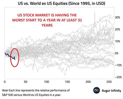
The first chart is the one that gets under my skin, because it’s not screaming “crisis.” It’s whispering “leadership is changing.”
US equities are underperforming global equities ex-US by roughly ~5% YTD, the widest margin since at least 1995.
On its own, that could be shrugged off as a temporary wobble. But it’s not happening in isolation.
We already lived through 2025, when the S&P 500 lagged the MSCI World ex-USA by ~12.4 percentage points.
If we see a second consecutive year of underperformance, that’s no longer a curiosity - it’s a shift in gravity.
Whenever I sense that kind of drift, I go back to a period that taught investors an uncomfortable lesson: the early-2000s rotation.
From 2002 to 2007, the S&P 500 total returns were -22.10%, +28.68%, +10.88%, +4.91%, +15.79%, +5.49%. Not a disaster. But not a monopoly either.
Over the same years, MSCI World ex-USA delivered -15.90%, +40.00%, +20.80%, +15.00%, +26.20%, +12.90% - beating the US year after year.
And this is where I can’t ignore the invisible engine behind so many rotations: the dollar.
The monthly correlation between DXY and EM equities has been about -0.40.
It’s not a law of physics, but it’s a useful compass. If the dollar softens, the rest of the world often gets oxygen.
That’s why I don’t view this chart as “US bad, RoW good.” I view it as the market quietly repricing where the next marginal flow wants to go, and how FX can amplify that decision.
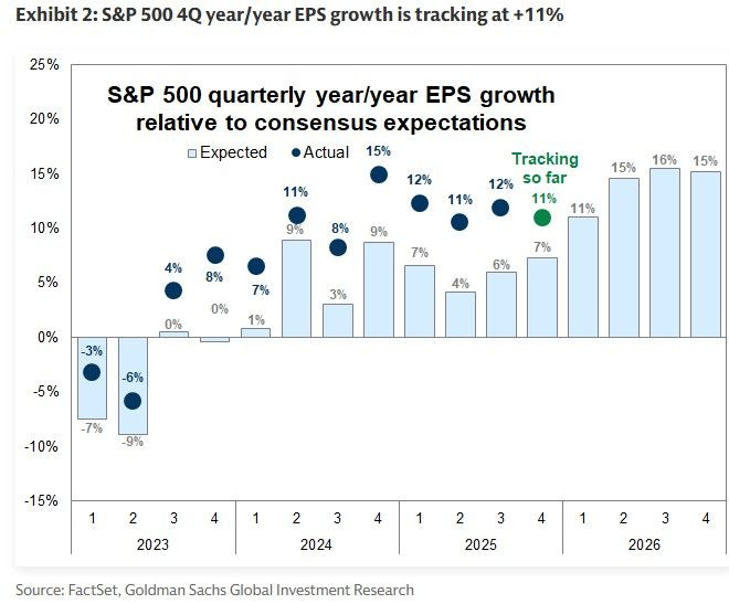
Then the second chart forces me to slow down - because it’s the antidote to lazy bearishness.
Earnings are not collapsing. In fact, Q4 EPS growth is tracking around +11% Y/Y versus ~7% expected. That’s real strength.
And when I see strong earnings alongside weak relative performance, I don’t panic - I get suspicious. Because markets don’t trade on what just happened.
They trade on what they fear is next.
I keep a very specific year in mind to stay honest about this: 2018.
That year, S&P 500 earnings growth was +20.49%, yet the index finished -4.38%.
The business did fine. The market repriced the terms.
That’s multiple compression - one of the most painful regimes for investors because it can feel irrational while it’s happening.
So when I see “EPS tracking +11%” and “US lagging ex-US,” I start thinking about a world where the economy doesn’t collapse, but the market refuses to pay the same premium.
A world where you can be “right” on fundamentals and still be “flat” on returns.
The kind of tape where the story becomes: earnings up, price flat, patience drained. That’s not a headline risk. That’s a regime risk.
⛏️ Real Assets Stop Being Optional
This is where the sequence turns from paper to physical, and the story becomes more emotional - because it stops being about opinions and starts being about what the world can actually produce.
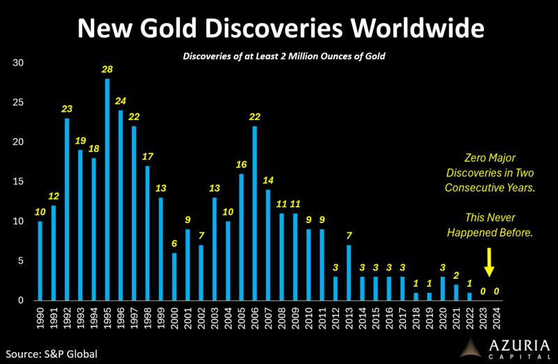
For the first time in recorded history, global data show zero major gold discoveries in two consecutive years.
That has never happened before.
And the part that really matters is what it implies: supply isn’t just tight today; the pipeline is thin tomorrow.
When discoveries dry up, supply becomes inelastic. When supply is inelastic, price becomes the adjustment variable.
And when price becomes the adjustment variable, volatility stops being an exception and becomes the cost of admission.
Whenever I want to remind myself what a scarcity decade can look like, I go back to the last major one.
From 2001 to 2011, gold rose roughly +643%. That wasn’t one clean inflation story. It was a decade of repeated reminders that confidence is fragile, policy is reactive, and monetary insurance has value.
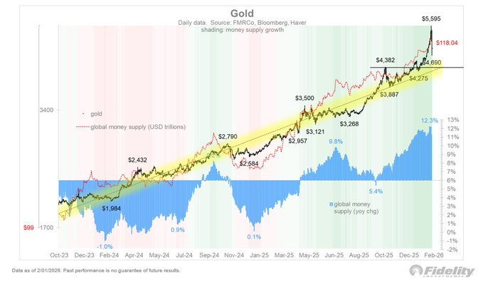
The next chart ties that scarcity to the monetary layer: global liquidity.
Global money supply growth around ~12.3%, and this is where I think many investors make a mistake.
They assume the “debasement trade” is synonymous with QE. It isn’t.
Debasement can be fiscal, institutional, geopolitical - especially in a more multipolar world where the system leans on balance sheets to absorb stress.
That’s why I pay attention to your tactical anchor: gold support around ~$4,400.
Not because I worship a line, but because levels reveal something about belief.
If gold holds that area through volatility, it usually means the market is treating pullbacks as “position clean-ups,” not “thesis failure.”
And I always want to quantify gold’s role in a portfolio through correlation, not ideology.
Over the last five years, gold’s correlation has been around ~0.31 to global equities, ~0.39 to US 7 - 10y government bonds, and roughly ~-0.03 to crude oil.
That’s exactly why it keeps reappearing when classic diversification gets messy.
It behaves differently. It’s not perfect, but it’s not redundant. It earns its place.
If I zoom the lens out, the trend speaks for itself. Since 2022, gold has climbed roughly +37%. That’s not the profile of an asset the market treats as a relic. That’s the profile of an asset the market treats as a response to regime uncertainty.
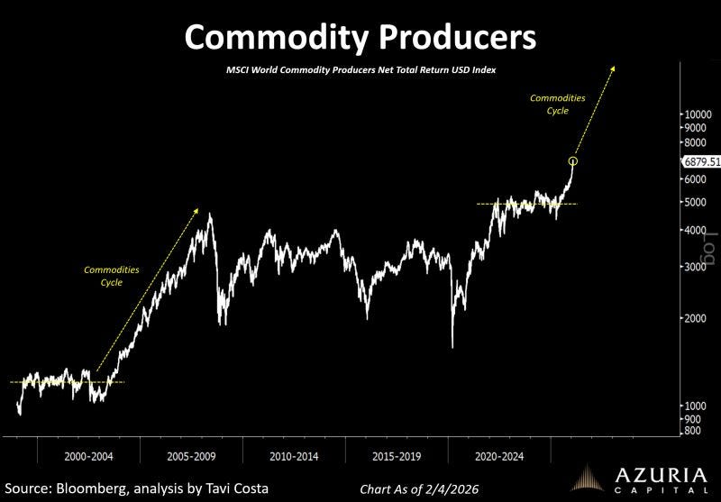
Then the commodity producers chart shows me the equity expression of the same reality.
If scarcity is structural, producers eventually become the bridge between the physical world and the capital markets.
But I keep repeating one line to myself because it’s the line most people underestimate: you can’t rebuild supply quickly. You can’t undo decades of underinvestment in two years.
2022 is still the clearest reminder of why this matters.
In a year when traditional diversification disappointed, commodities (BCOM) gained about +16%.
And again, the correlation profile explains the “why.”
Historically (1994-2023), BCOM has shown correlations around 0.35 to US equities, 0.01 to US fixed income, and -0.44 to the US dollar.
In other words, it doesn’t just move differently - it tends to move differently for structural reasons tied to the dollar and real-economy supply constraints.
When I look at scarcity, liquidity, and producers together, I don’t feel like I’m looking at a late-cycle mania.
I feel like I’m looking at a system that is slowly realizing it can’t solve real-world shortages with narratives.
It has to solve them with capital, time, and political permission - and those are all scarce too.
🚚 The Economy Sends a Warning
Then we hit the labor signal. And this is where the story turns from “rotation” to “risk.”
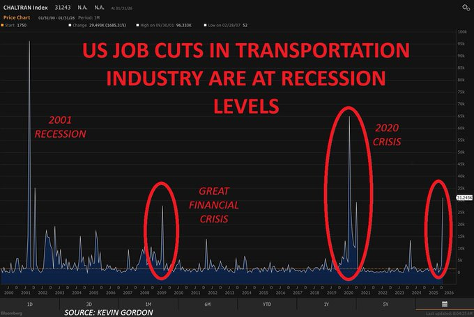
US job cuts in transportation are flashing at recession-like levels, with 31,243 job cuts in January 2025, driven by UPS planning up to 30,000 cuts.
I don’t treat transportation as a random sector. I treat it as a high-signal transmission mechanism - goods, inventories, consumption.
When transportation weakens, it often means the real economy is quietly losing momentum.
And when I want to translate that into market memory, I think in performance outcomes.
In the last three major recession-style episodes, the S&P 500 annual returns were -11.89% in 2001, -37.00% in 2008, and +18.40% in 2020.
The lesson is not that every labor warning becomes 2008.
The lesson is that labor deterioration forces the market to simultaneously price policy, earnings revisions, and credit stress - and that combination changes leadership fast.
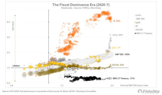
This is where your “fiscal dominance” framing becomes the emotional core of the note for me, because it’s about what happens when the old diversification tools stop behaving.
In the fiscal dominance era, I don’t ask, “Which narrative is trending?” I ask, “What are correlations doing?”
The bubble-style chart captures exactly what I’ve been feeling: precious metals rising in rank despite low correlation, Bitcoin losing some market share recently, long bonds sitting dead last even as their correlation profile flips.
This is the regime where bonds can stop being the automatic hedge. And that’s when portfolios get exposed - not because investors were reckless, but because they relied on historical relationships that quietly broke.
Then we arrive at the Fed.
⭐️ This is a paid content, so scroll to read it…[🎁 #7 BONUS if you become a PRO today]
If you’re a PRO subscriber, make sure you’re logged in to access the full piece.
If you’re still a FREE reader, you have exclusive options to unlock this special edition and all past PRO content.
🗣️ Read what others say about us. TrustPilot - Don’t take my word for it.
🎁 Special Today - 7 bonuses if you become a PRO (FREE)👇
(These bonuses alone are worth more than the subscription.)
🎁 BONUS #1 - Price Locked Forever (you’ll never pay more)
🎁 BONUS #2 - Monthly Live Mastermind (value: $1,197/year)
🎁 BONUS #3 - Full App Access: all exclusive content, anytime, anywhere
🎁 BONUS #4 - Private Community Access: the Macro Mornings Family
🎁 BONUS #5 - Premium charts + Macro Asset Dashboard (FREE version)
🎁 BONUS #6 - Full access to 650+ advanced research analysis
🎁 BONUS #7 - Free copy of my book “51 macro strategies”
🚨 February 2026 Flash Sale
✅ Macro Mornings PRO (Save 40% forever)
Only 8 spots left → FROM $570/year TO $342/yr (or $29/month)
✅👑 Lifetime (Best value)
Only 6 spots left → FROM $1,140 TO $798 one-time (or $13/month)
👉 After payment, you’ll receive a Welcome Kit by email with all the material and instructions to join.
2. 👉 Or start your 7-day FREE Trial - exploring only the PRO analyses without any risk. [Click here]
Keep reading with a 7-day free trial
Subscribe to Macro Mornings 💡 to keep reading this post and get 7 days of free access to the full post archives.


