🤯 [LIQUIDITY INJECTION] $5.2 Billion into the U.S. Banking System
December 18, 2025 >> This is the 6th largest one and surpasses even the peak of the Dot Com Bubble
🎟️Markets are changing faster than most investors can react
🎄Get Today Your 2 FREE Tickets Pass🎄
Join me for a private 45m strategy session where you’ll gain a crystal-clear view of the macro forces driving 2026 - and learn how to turn uncertainty into opportunity.
👉 Book your Macro Advisory Session with the Founder [Totally Free here]
👉 LIVE Mastermind Session - January 17th, 2026 - [Get Your Free Access]
Dear Investor,
I’m looking at the charts the way I’d look at a sequence of scenes in a film: each one adds a new detail, each one tightens the plot, and by the end you realize the market isn’t merely debating the next data point - it’s debating the entire regime.
What makes this setup so powerful (and potentially so unstable) is the tension underneath it.
Rates are already leaning toward “easing.” Equities are still priced as if the future is friendly.
And in the background, the plumbing of the system is quietly being managed so the machine keeps running.
That mix can last longer than people expect. But when it breaks, it rarely breaks gently.
🧭 Cuts are priced, but inflation and labor still argue back
The first chart sets the tone immediately.
OIS implies ~50 bps of cuts through 2026, while the Fed’s dot‑plot is closer to ~25 bps.
That gap isn’t an academic detail - it’s the market and the Fed living in two different futures.
When I see a disagreement like that, I don’t obsess over who is right.
I ask myself what kind of world must exist for each side to be right.
For the market to be right, something has to cool materially - growth, hiring, confidence, or all three.
For the Fed to be right, inflation has to keep bending lower without the labor market bending too far. And that second condition is harder than it looks.
That’s why the electricity inflation chart matters so much.
Over the last 10 years, electricity inflation roughly matched headline CPI around ~3%+ annualized.
Over the last 5 years, the gap opened: electricity ~6%+ versus CPI ~4%+.
Even the forecast still shows electricity running hot: ~4%+ versus CPI just under ~3%.
To me, this doesn’t read like a temporary quirk.
It reads like a structural pressure: a grid and an economy adapting to a new demand shock.
Directionally, electricity and headline CPI have moved closely in long samples - think a back of the envelope correlation around ~0.90 over the last decade - but electricity has been persistently higher in level.
That is exactly how inflation stays alive even when the market wants the “all clear.”
Then the labor picture adds its own tension.
November payrolls came in at +64,000 (vs 50,000 expected), but unemployment rose to 4.6% (vs 4.5% expected), the highest since September 2021.
Meanwhile, manufacturing employment has been drifting lower through 2025 - down roughly ~70k from early‑year levels.
I’ve always viewed manufacturing as an early signal - quiet when it changes, loud in hindsight.
When manufacturing momentum fades, unemployment pressure tends to follow.
In decade‑long samples, the inverse relationship can be striking - think a back of the envelope correlation around ~-0.91.
So the disagreement in chart one becomes more than a pricing quirk: it becomes a fork in the road.
If unemployment drifts toward ~5%, the Fed typically stops “fine‑tuning” and starts acting more decisively.
If unemployment stabilizes and inflation stays sticky (remember electricity), the market’s ~50 bps of 2026 cuts starts to look ambitious.
And this is where I like to keep one historical memory in the back of my mind - not as a forecast, but as a warning label.
In the 2000 - 2002 unwind, the 10‑year Treasury yield fell from ~6.66% (Jan 2000) to ~3.94% (Oct 2002) - a move of roughly 272 bps - while equities went through a full repricing (S&P 500 roughly -47% peak to trough; Nasdaq roughly -78%).
Bonds were telling you “growth is fading” long before equities were ready to listen.
If you remember nothing else from this section, remember this: when cuts are priced because growth is rolling over, duration can rally hard, but equities usually need time - because earnings, not rates, becomes the dominant story.
⚖️ Extreme valuations meet extreme positioning
Now the story shifts from “what is priced in rates” to “what is priced in equities.”
And here, the market is not subtle.
Your tech versus defensives chart is the kind of chart I never ignore.
US technology stocks are trading at their highest valuation premium relative to defensive stocks since the Dot‑Com peak.
This is an extreme - rare enough to deserve respect.
When the market pays an unusually high price for long‑duration growth, it becomes allergic to anything that threatens the narrative.
It doesn’t need a recession to create pain. It only needs a shift in belief.
Back in 2000, the mechanism wasn’t simply “rates were too high.”
The mechanism was that expectations became impossible to satisfy.
In the months after the peak, Tech fell more than ~50% over roughly the next ~9 months, while defensives rose more than ~35% over the same window.
That’s what a regime shift looks like in relative performance.
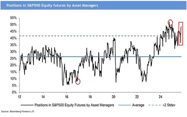
And then we layer the positioning chart on top - because expensive markets can stay expensive, but expensive markets with crowded positioning become fragile.
Net long positioning by asset managers in S&P 500 futures is ~49%, near the highest on record.
Against a long‑term average of ~26%, it’s nearly double normal, and it sits more than 2 standard deviations above history.
Since 2022, net exposure has surged about +400%.
You can see the psychology in the tape.
The S&P 500 has printed 37 all‑time highs this year, after 57 last year and 70 in 2021.
This doesn’t force an immediate sell‑off.
But it changes the way I think about risk.
In crowded markets, the rally can extend further than skeptics believe - because trend and momentum are powerful.
At the same time, the drawdowns can arrive faster than optimists imagine - because when the marginal buyer is already committed, a negative surprise doesn’t find a gentle bid.
It finds a vacuum.
So when I combine chart one (cuts priced) with chart two (valuation extremes) and chart three (crowded longs), I don’t hear the market saying “everything is fine.”
I hear it saying: the margin for error is thin.
🧠 Wealth effects and an asset‑driven economy
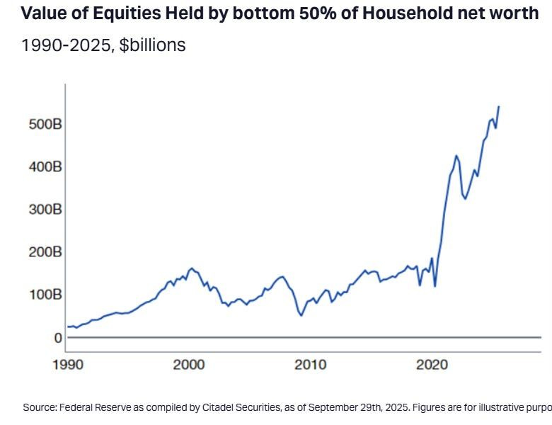
This is the part of the story that explains why the recession that everyone predicted keeps failing to materialize.
The chart on equities held by the bottom 50% shows that equities held by the bottom 50% of households have risen above $500B.
That is a quiet but meaningful support under consumption.
When people feel wealthier, they behave wealthier - often without even realizing it.
⭐️ This is a paid content, so scroll to read it…[🎁 #4 BONUS if you become a PRO today]
If you’re a PRO subscriber, make sure you’re logged in to access the full piece. And if you’re already Annual/Lifetime member 👉 Access to 🧠 Macro Mornings Family.
If you’re still a FREE reader, you have two exclusive options to unlock this special edition, all past PRO content and the App’s Special launch:
1. 👉 Pro Membership from 30% to 50% OFF - forever. Only 1 spots last:
⭐ PRO Membership - $399/year or $33/month (Regularly $570) [Click here]
👑 Lifetime - $798 one time only or $13/month (Regularly $1,140) [Click here]
+
🎄Today you also unlock 4 bonuses (FREE)👇
(These bonuses alone are worth more than the subscription.)
🎁 BONUS #1 - Price Locked Forever (you’ll never pay more)
🎁 BONUS #2 - Private Community Access: the Macro Mornings Family
🎁 BONUS #3 - Full App Access: all exclusive content, anytime, anywhere
🎁 BONUS #4 - Monthly Live Mastermind (value: $1,197/year)
We answer the community’s biggest questions, break down real-world cases, and share actionable macro frameworks..
👉 After payment, you’ll receive a Welcome Kit by email with all the material and instructions to join.
2. 👉 Or start your 7-day FREE Trial - exploring only the PRO analyses without any risk.
If you’re serious about understanding what comes next - and acting before the crowd - this email is your edge.
Keep reading with a 7-day free trial
Subscribe to Macro Mornings 💡 to keep reading this post and get 7 days of free access to the full post archives.


