
🕵️♂️ Fiat Currency will be Dead
September 13, 2025 >> The Gold market is sending a clear signal

💡 New on Macro Mornings? Start here
🎯 This is part of a series designed for PRO investors who want real-time updates on macroeconomic news through my advanced insights. Feel free to catch up on previous emails here if you'd like to start from the beginning!

Dear all,
When I look at the map of global capital flows, one story keeps repeating itself, and it has my full attention.
Today, more than 40% of European equity exposure sits in the United States, a dramatic rise from just 15% in 2009.
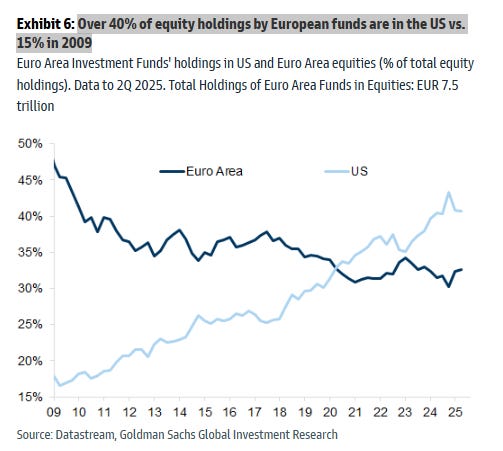
I’ve seen this sort of imbalance before, and I know it rarely ends quietly.
During the Eurozone sovereign debt crisis between 2010 and 2012, confidence in European equities collapsed.
Investors fled, pushing the Euro Stoxx 50 down -35% even as the S&P 500 rose +16%.
The euro itself couldn’t withstand the pressure, tumbling from 1.50 to 1.20 against the dollar in less than two years.
Watching that unfold was like watching trust dissolve in real time, and it left a mark on me.
It showed me how capital moves when fear takes hold: it runs toward strength, even if that strength is temporary.
Today, as I see European capital bleeding into U.S. markets once again, it feels like history’s shadow is leaning over our shoulders.
But shifts like this don’t go on forever.
Policy shifts, valuations, or sudden shocks eventually flip the story.
And when the reversal comes, it is often violent, catching investors flat-footed.
🥇 Gold’s Signal to the World
Against this backdrop, gold has been quietly telling its own story.
Adjusted for inflation, gold now trades at $3,610/oz, a figure that surpasses even the legendary spike of 1980.
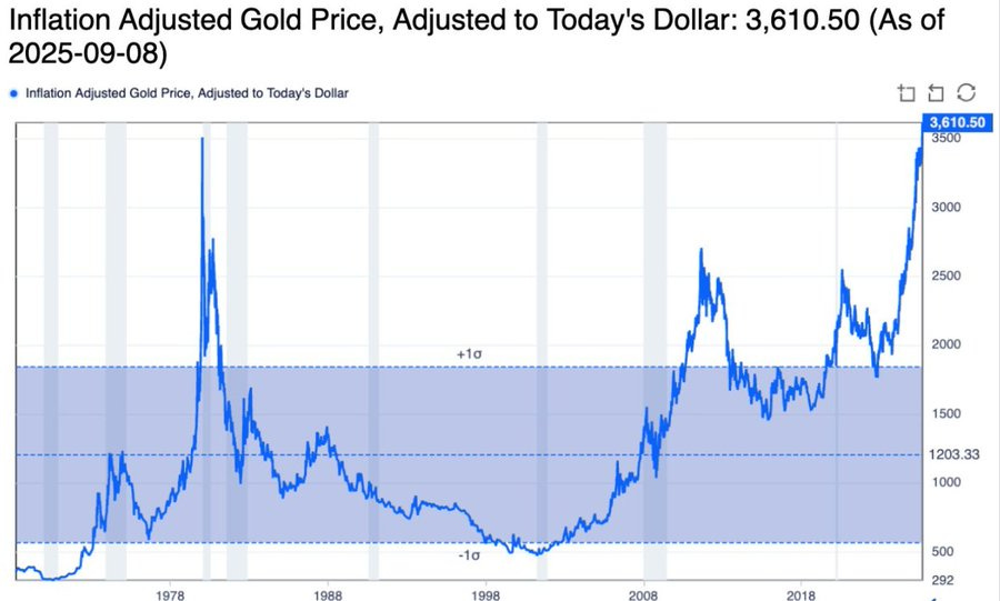
That moment in history was fueled by panic over inflation and geopolitical uncertainty, but what crushed the gold rally back then was the surge of U.S. 10-year yields climbing above 15%.
Real yields suffocated gold.
But today we’re in the opposite situation: inflation remains sticky while rates are poised to fall.
This is why I keep reminding myself of history - because in every easing cycle of the past fifty years, gold has delivered.
On average, it gained +27% in the first year after the Fed began cutting rates.
That isn’t just a number to me.
It’s a story that markets have told over and over again: when faith in fiat starts to slip and liquidity begins to return, investors reach for what is real, and gold responds with force.
I can almost feel the rhythm of this cycle in my bones, because it matches what history has shown so many times before.
And as I look around in 2025, I see faith eroding again, one subtle crack at a time.
🏦 Cracks in the Foundation
The Fed’s balance sheet tells another part of this unfolding drama.
From its peak in 2022, it has contracted by $2.36 trillion, bringing the total to $6.60 trillion, the lowest since April 2020.
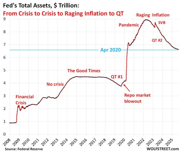
For many, this might sound like just another statistic, but to me it speaks volumes.
I vividly remember the 2017 - 2019 period, when the Fed unwound just $700 billion and markets recoiled.
The S&P 500 dropped -20%, the dollar surged +10%, and investor sentiment soured almost overnight.
What we are seeing today is three times that scale, yet equities continue to soar as if gravity no longer applies.
It feels like watching a dancer glide across thin ice: graceful on the surface, but with cracks spreading underneath.
And then comes the labor market, whispering another warning.
The BLS has quietly revised away 1.73 million jobs across 2024 and 2025.
Revisions of this magnitude are not minor footnotes - they are seismic signals.
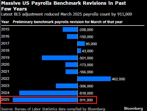
I can’t forget 2007, when similar downward revisions arrived just before the Fed slashed rates in desperation.
What followed was the global financial crisis, when the S&P 500 collapsed -57% and the 2-year Treasury yield plunged from 5% to 0.6%.
Those numbers aren’t just history - they are scars.
And as I watch the revisions today, I feel the same unease that I felt back then.
🤖 Narratives and Excess
At the very same moment, Wall Street is intoxicated with optimism.
In Q2 2025, 287 S&P 500 earnings calls mentioned AI, four times more than three years ago.
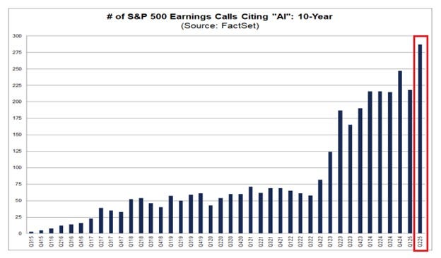
The 10-year average sits at just 79. These numbers would be impressive on their own, but what makes them ring in my head is their similarity to another era I lived through - the late 1990s.
Back then, “dot-com” dominated every conversation.
The Nasdaq roared higher, surging another +85% in a single year, only to unravel in spectacular fashion. I am not dismissing AI. Far from it.
I see its transformative power, and I believe it will reshape industries for decades to come.
But when narrative becomes the foundation of markets, when optimism drowns out caution, risk builds in silence.
And in this silence, excess gathers. Add to that the fact that this bull market is only 2.9 years old, and history’s patterns whisper loudly in my ear.
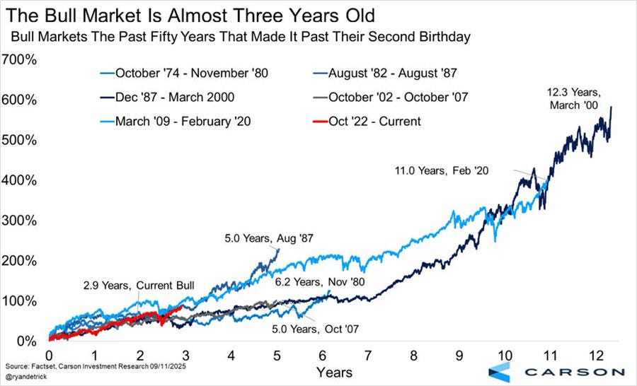
Bulls that survive past two years tend to last about 8 years, delivering massive gains.
⭐️ This is a paid content, so scroll to read it…
If you're a PRO subscriber, make sure you're logged in to access the full piece.
If you're still a FREE reader, you have two exclusive options to unlock this special edition and all past PRO content:
1. 👉 Pro Membership from 30% to 40% OFF - forever. Only while spots last:
🎁 PRO Member - $268/year or $22/month (Regularly $447) [Click here]
🎁 Lifetime - $621 one time only or $10/month (Regularly $887) [Click here]
These prices it’s locked forever.
2. 👉 Or start your 7-day FREE Trial - explore everything without any risk.
If you're serious about understanding what comes next - and acting before the crowd - this email is your edge.
Keep reading with a 7-day free trial
Subscribe to Macro Mornings 💡 to keep reading this post and get 7 days of free access to the full post archives.